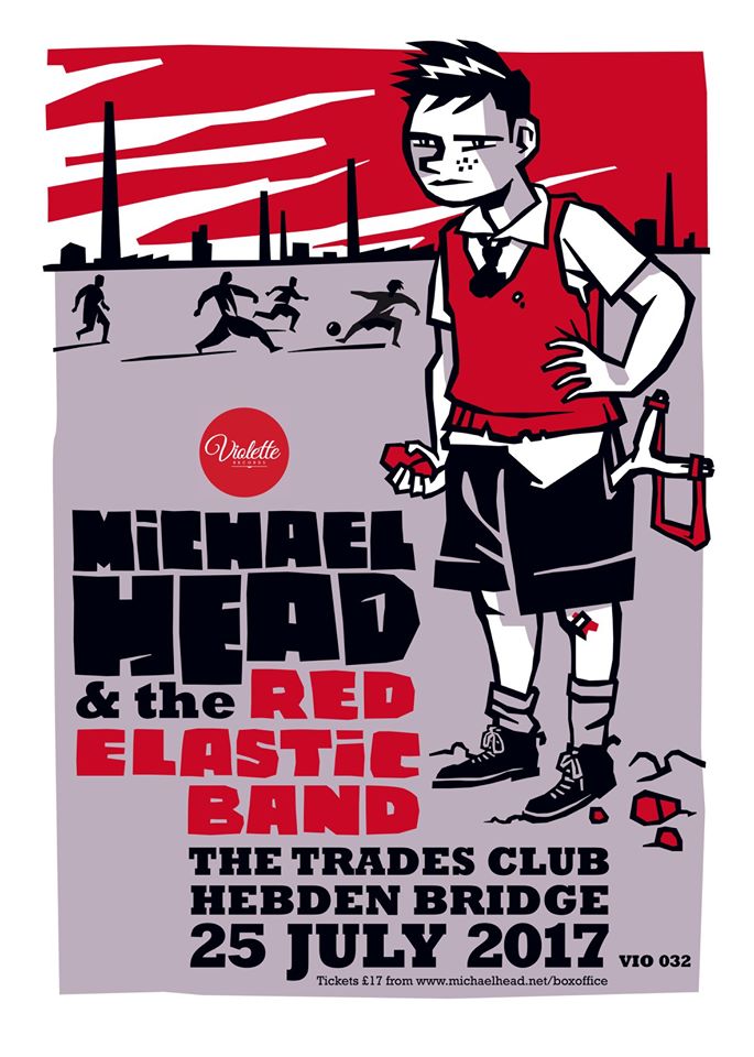
GRAPHIC DESIGNER AND APPLIED ARTS TEACHER, FRÉDERIC LE FALHER ILLUSTRATES « JOHNNY », HIS FIRST BOOK.
« Johnny », published by Balivernes
Texts : Pierre Crooks / Illustrations : Fred Le Falher
CONVERSATION WITH FRED LE FALHER
Fred, let’s start with this book published by Balivernes éditions in November 2020, « Johnny », for which you are the illustrator. Pierre Crooks wrote the texts. What does this edition mean to you? Is it just fun or is it a recognition? A kind of achievement?
Wow, this book on Johnny is a « fun and funny » thing, of course, but it’s also much more than that.
You have to know that I love books. I have a lot of bookshelves, they overflow everywhere, as do magazines, which I keep preciously. It takes up an incredible amount of space but the house is big! I belong to a generation that is still very attached to the object, and particularly to the paper medium. Among all the books I collect, there are a lot of children’s books, because it’s a sector where you can find really beautiful things.
Is it?
Of course it is! Adults are wrong to think that so-called « children’s books » are only for children. Editions du Rouergue and Thierry Magnier, to name but two examples, have published books that are aimed as much, if not more, at graphic design enthusiasts as at children. There is a diversity and creative richness in this field that you can’t find elsewhere. And I’ve been dreaming for years of bringing out a children’s book, i.e. a book that gives pride of place to images and illustrations. So obviously, the proposal from Pierre Crooks, the boss of the publisher Balivernes and author of the texts of « Johnny », came to me like a gift from heaven.
That’s often the hardest part of making a book: finding a publisher. This is one of the reasons why I had never taken the plunge, even though the idea had been in my head for years. Approaching publishers for children’s books takes time and you can never be sure that it will pay off, you have to be prepared to take a lot of rejections. But that’s cool, I skipped that step.
Okay. You’re telling me that you’ve been wanting to get a book out for a long time. You’re telling me that you’ve been thinking about putting out a book for a long time, but that you hadn’t written the first word of the first paragraph of the first chapter, because you were saying, oh dear, finding a publisher, what a pain?
That’s a bit of it. I think I was always putting this project off, a bit out of laziness, out of lack of time too, and then because I didn’t really know which side to attack the mountain from: writing a story? To make the drawings afterwards? To do both at the same time? And then, how to proceed? Do I manage to do self-publishing? A small format digital print with a 300g cardboard cover? Well, not really… Canvassing publishers, OK, but which ones, knowing that the sector is saturated? And how do I go about it? I’m totally out of touch with technology, I don’t have a personal website, I’m not on Instagram, I just throw my drawings on Facebook and that’s already an achievement for me, so it’s not easy to be credible today as an illustrator if I’m lagging behind on my own visibility…
Why exactly are you lagging behind? Are you lazy to work on this visibility, or are you not interested? Or both.
A bit of both. I’m not very comfortable with the trends of the time, I think everything is moving too fast and that invasive technology is ruining our lives. I tried to get a phone with a touch screen, but it quickly bored me, so I went back to a touch phone, a model for old people, and I’m fine with that. So I’m not really « modern » in my way of communicating, and besides, I don’t really want to make the effort.
In short, I let it drag on, waiting for a helping hand from fate, as they say. And since I was born under a lucky star, it finally arrived. Pierre is a childhood friend, he created the Balivernes publishing house about fifteen years ago, and for almost as long we’ve been saying to each other « so, when are we going to make a book together »? We let time go by, he and I, but when we reached 50 years old, we thought it was now or never… And as I regularly draw for the rock scene, he had the idea of starting our collaboration with a book about Johnny. It was the perfect subject for me to try my hand at this new exercise, and I got excited about it.
I understand that. How is Johnny an ideal subject? The rock connection, I see. But otherwise?
Well, to tell you the truth, our very first track with Pierre was a western. I love westerns. Sergio Leone, of course, but also the « real » westerns : John Ford, Howard Hawks, Anthony Mann, all that…
Oh, great. I have a friend who loves westerns and he wrote a western. A novel. It’s called « Quand Fleurissaient les cow-boys ». Thierry Girandon. Do you know Thierry Girandon?
Oh no, I’m sorry, I don’t know him. I have to say that I read a lot of newspapers, but very few novels. It’s not that I don’t like them, but I don’t have much time. A colleague recently lent me a western novel, « Faillir être flingué », by Céline Minard, but I gave it back to her after several months, without having started it.
A bit, but it’s okay. So, what about this western story?
I had suggested to Pierre that he write a western script for me, which I would then illustrate. Except that I couldn’t do it: a far-western town + the stagecoach with the team of horses + a herd of buffalos + an Indian attack + a general fight in the saloon and so on, it was too complicated to draw for me. It really was. I spent almost a year on it, nothing to do, it didn’t go anywhere. It was a total mess. I was forced to give up, or at least to ask for an extension, and I wasn’t proud. That’s when Pierre told me: « Don’t worry, I have another idea ». And he explained to me that he was thinking of a book about rock, reserving this project for me because he knew I would be right in my element. We gave ourselves one or two weeks to think about it, and then he called me back to say: « What if we did a book about Johnny? His childhood, his adolescence, his early years, how Jean-Philippe Smet became Johnny Hallyday… ». And then it was obvious. Not that we are big Johnny fans, him and me. But telling the story of Johnny’s youth meant drawing the France of the 50s, the beginning of the 60s, the arrival of rock, Teppaz, transistors, electric guitars, the design, the clothes, the graphics of that era, a whole visual environment that I love. Beyond Johnny, it’s a universe, a context that is familiar to me.
Tailor-made, in fact?
Exactly. I was able to stay in my comfort zone. And then, shit, I have to admit it: I don’t give a shit about the last forty years, but I don’t throw everything away. There are a lot of songs from the sixties that I really like (« Retiens la nuit », « Pour moi la vie va commencer », « Tes tendres années », « Excuse-moi partenaire »…) and then there’s his 1966 album, « Génération perdue », recorded in London, which is really cool, with at least five or six great songs on it. No kidding. In 66, Johnny had a great face, a great look, great musicians, great arrangements… In short, I must admit that just for those years, I always had a certain affection for the guy, despite everything that followed… So I went straight to it. I was ultra-motivated, with the added desire to fight because I kept the screw-up of our western in my throat. No way I was going to screw up this time.
All right, then. So here you are, embarking on the adventure. This is your first book, you’ve never done this before. What do you discover first, by tackling this new work?
I’m discovering a new way of working, which I thought was a continuation of what I knew how to do, but not so much, once I’m confronted with the blank page… In general, I’m asked to do commissioned work in the cultural field: concert and festival posters, record sleeves, theatre posters. On these types of media, the illustration is always designed according to the lettering, and a balance must be found between the image and the typography. The one cannot go without the other. With this book on Johnny, I realise that it’s the first time in a very long time that I’ve done pure illustration, free of imposing titles. Without the « crutch » of the title (which usually helps me to compose the image), I found myself faced with completely blank pages, to be filled with drawings only. And that was quite a new situation. So obviously it was a bit of a challenge for me. Especially as it wasn’t a question of making a single image, a striking « one shot » as is the case on a poster, but a series of twelve narrative images that must work together, form a coherent whole. Hence the need to define an assertive style for the twelve drawings, and to maintain this style over time: this was also very new, and very different from my usual method, where I can adopt a different register from one work to the next, depending on the universe being addressed.
No crutch, then. But there is a constraint, a direction to stick to. Because there is you, who illustrates, and there is Pierre Crooks, who writes. How did you go about it?
Pierre wrote the texts first. He sent me a first draft quite quickly: ten short sentences, ten moments from Johnny’s youth, which corresponded to ten double-pages, the principle being to do one large illustration per double-page, so ten illustrations in total. Do you follow me?
Of course.
The texts in question were not very directive, and that’s good: they evoked a period in Johnny’s life, but not a precise event. Nothing anecdotal, for example, that would have forced me to « stick » to the text. So that leaves a lot of room for manoeuvre when it comes to putting it into images. It’s more complicated, it forces you to think, but it’s a good thing, at least it avoids the pitfall of paraphrasing. With hindsight, perhaps my work on theatre posters (where you have to synthesise the atmosphere of a play rather than illustrate a precise moment in the story) was very useful. Here, it was a bit similar: a single drawing to evoke Johnny’s birth in Paris, the abandonment of his father, the mother who entrusts him to her aunt and her two daughters; another drawing to say that Johnny is brought up by his dancer cousin, who marries an American artist, who will become a kind of surrogate father; a third drawing to talk about the child of the ball, tossed from music hall to cabaret stage in the wake of his adopted family… Each time, the same problem: how to fit « all that » into a single image?
For the reader, it just rolls off the tongue. It’s really classy, it’s a proof of success a fortiori, the fact that the reader – child or adult, we agree – doesn’t imagine for a single second the work behind it, the « problems », as you say.
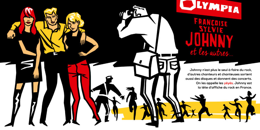
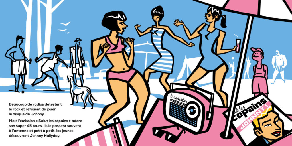
So much the better if the image and text work well together, that was one of the issues I had to deal with. Especially since another parameter comes into play, and not the least: with each page, the years go by, Johnny grows up, we’re no longer in the same era, nor in the same context. Unlike a classic story like « Peter and the Wolf », with a unity of place and time, we find ourselves in a story that is spread out over many years. This means that we have to reinvent everything with each drawing: Johnny at 2, Johnny at 6, Johnny at 9, 14, 17… And we have to set a new scene on each page, since I go from a public garden to a flat, from a theatre stage to a teenager’s bedroom, from a campsite to a television studio… This implies quite a lot of documentation, in order to situate an era without creating anachronisms. For example : the posters of Trénet and Tino Rossi that we see on a theatre wall are inspired by authentic models; the magazine « Salut les Copains » that hangs out on a camping table is based on the cover of the first issue published in the summer of 1962; the yé-yé Johnny surrounded by Françoise Hardy and Sylvie Vartan is based on the pose of a famous photo by Jean-Marie Perrier (hence the presence of the photographer in the back immortalizing the trio)… It doesn’t look like much, but it’s a hell of a job for a first book!

That’s exactly it: « It doesn’t look like much ». You get to know the book and everything is obvious. But tell me, now I’m looking at it again and I’m thinking back to the moment I first had it in my hand, to my first impression: this very special format, really top notch, well, I suppose it turned things upside down for you. We’re no longer in the « poster » format. As you work, you had to reconsider your experience, so to speak, and take into account the imperatives of the book object. An object that you open, pages that you turn. I don’t really know how to explain what fascinates me about it… Basically: each illustration tells a story within a story, and it’s absolutely successful. To achieve this, you couldn’t just show a succession of images and then vogue la galère. It’s the whole process of your work that I find so damn interesting.
It’s clear that working on a book was completely different from my usual experiences. Particularly with regard to the format, which you mentioned. The book is square, so when you open it, it gives a very long, panoramic frame. That alone was quite new for me, as I’d been used to vertical formats (posters) or square formats (record sleeves) but never horizontal ones. I had to leave a « neutral » zone on each illustration to accommodate the two or three lines of text, but that still left me quite a lot of space to draw. A horizontal space, therefore, and very stretched, like a cinemascope. Not easy to occupy, this kind of format. So, almost by reflex, I adopted cinematographic processes, as you say, with very pronounced foregrounds, which allow you to create volume and depth of field. That’s why we often see an object or a character in the foreground, on one side of the image: the head of a pigeon, a wall with posters, the foot of an umbrella, the thick neck of a soldier… It’s never an essential element, it’s just there to give relief to the scene.
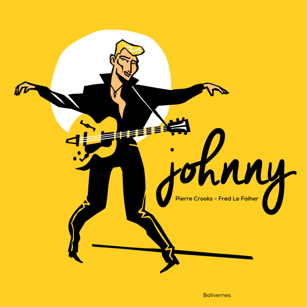
Since it’s a series of images, with a form of narration, I also had to create a rhythm, not to fall into repetition… That again is very different from a poster, which works by itself. So I tried to vary the points of view, by never putting Johnny in the same place, for example. Once on the left, once on the right, upwards, then downwards, sometimes in the foreground, sometimes in the background, static then moving… etc. All this while avoiding any effect of symmetry, a compositional principle that I avoid like the plague because it freezes an image instead of making it more dynamic. The cover of the book, for example, is not symmetrical: I could have put the character in the middle with the title underneath, also centred, but I hate that, even if it’s done very often. I prefer to move the character to the left and place the title on the right, it’s much more dynamic.
I also thought a lot about the colour, which I used sparingly. Rather than overdoing it, I limited myself to a dominant two colours per image. It’s a rule I always use in my work, and it’s in line with a quote from Jacques Tati that the Inrocks-mensuel had adopted at the time as a motto: « too many colours distracts the viewer ». Personally, I often make do with black and white + a single colour: if you manage well and use the white of the paper intelligently, it’s enough. I do a lot of screen printing, and it’s a good school for that, which forces me to limit the number of colours, in order to limit the number of screens and therefore the ink passages. Here, I relaxed the rule a bit by slipping a little yellow everywhere (Johnny’s hair) and tiny touches of blue (the eyes) but otherwise, we’re still in a different coloured atmosphere at each turn of the page. It causes little surprise effects, breaks, a different pulse on each image… That was a bit of the idea.
Another big difference in the illustration, compared to my work as a graphic designer, is that Pierre gave me complete carte blanche: he sent me the texts, and vogue le navire…
Funny, that. Earlier, I said « vogue la galère », and you say: « vogue le navire ». It seems that for me work is a ship, for you it’s a ship….
Well… Ship, galley… It’s all a question of comfort, the main thing is that it floats and moves forward, right?
Yes. Well, you were telling me about this famous carte blanche that Pierre Crooks gave you.
Yes, back on dry land: I was talking about « carte blanche » because graphic design is commissioned work, which works a lot by going back and forth between the « client » (that’s not a very nice word) and me. Sometimes you have to submit several ideas before it clicks, there are always changes to be made, variations to be tested, adjustments to be made until it’s validated, we nitpick on details, it can take a lot of time but that’s part of the job. In this case, I was almost the only one in charge and that can be quite destabilising, especially on a job of this magnitude. But Pierre reassured me, he’s naturally quite serene (unlike me) and he liked the first pages I sent him, so that gave me confidence and I was able to see it through to the end, in a fairly relaxed atmosphere.
That’s cool. Happiness…
The only pressure, in fact, is the one I put on myself, but that’s another problem, you can’t do it again…
So I’ve heard. How long did the work last?
From the first draft drawing to the final validation of the files, we’ll say that the project took five or six months, from April to September 2020… That’s a long time, but we took our time. Well, especially me, but that’s because I was working on it very irregularly: my activity as a graphic designer and/or illustrator, I carry it out on the fringe of my « real » job, which is an applied arts teacher in a vocational school. Of course, we were in the middle of a lockdown last spring, so that leaves time, but I had lessons to give to my students, contact with their families, daily homework follow-up for my two daughters, the youngest (3 years old) to manage since he wasn’t going to school either, work to do in the house, messenger-appetizers (!), summer holidays in the middle of all that… In short, it was difficult to work continuously, it was done little by little.
Apéros-messengers, ouch, did you do that?
Well yes, like an idiot who was fed up with drinking alone… My partner doesn’t drink or doesn’t drink much, nobody’s perfect, so we tried this system with brothers and sisters or friends, but it quickly became very boring: as soon as there were more than two of us, it was a mess.
Hey, hey! But I cut you off. We were talking about time and the duration of the project.
You confused me with your story of aperitifs… Oh yes, between two whiskies, something happened, the project evolved… That also explains why it took longer than expected. Originally, « Johnny » was to be a book for toddlers, like 3-4 years old. Small format, thick cardboard pages, rounded corners, text limited to the strict minimum… Except that I drew in my own way, without necessarily trying to adopt a « childish » style, let alone a « baby » one. So when Pierre received the first illustrations, he looked at them with his colleagues (the salesmen, in particular, who were in charge of canvassing bookshops) and they found that they didn’t really look « 3-4 years old », but rather a higher age bracket, maybe « 7-8 years old ». So we switched to another collection at Balivernes, which meant a few changes: a larger format (but still square, fortunately, otherwise we would have had to start all over again), paper pages instead of cardboard, more text, two extra double-pages (so twelve pictures instead of the initial ten) and end pages to introduce the book… It meant extra work for me, but I couldn’t have asked for more. Twenty-four illustrated pages make for a much fuller book, and it’s a lot more rewarding, especially with beautiful endpapers. It may not look like much, but it changes everything when you open the book. I noticed this first hand when I discovered the printed « Johnny »…
Yes, I can confirm that. That is to say, I assure you that the book has an effect as soon as you open it, I’m not kidding, something beautiful, very nice and effective literally jumps out at you. Take my word for it, I’m here to chat and talk about your work, not to shine your shoes. Now I can only imagine how you felt when you first got your hands on the book.
The day I received the first copies of the book, I was crazy. There were about ten copies in a box that barely fit in the mailbox, I tore the package apart quite wildly, all in a frenzy. I’m always impatient to see the final result of a job, because for me, as long as a poster or a record sleeve is not printed, it’s just an image on a screen, it doesn’t really exist. With the book, the effect was tenfold. Even the format surprised me: I hadn’t measured the impact it could have, 24 cm on a side. Especially when you open the book: I work on a computer which is not at the top of visual comfort (!), so when I displayed a double page on the screen, it was much smaller than the same double page in « real life ». It gave my little drawings a look that I hadn’t anticipated, I completely rediscovered them.
Okay. So I can imagine something else again, another « delight »: it is the touch of the book, the downright tactile dimension of the object.
Affirmative, Mr. Publisher!
Publisher among other things. I am also the one who interacts with the great and good of this world. In short: the tactile aspect.
I hadn’t imagined the touch of the paper either: a slightly rough feel, not glossy, not smooth, with a matt print, everything I like. And the cover, with its selective varnish, impossible to visualize on screen… The hyper intense yellow, even better than I expected… And the famous cover pages, which highlight what is going to follow… It was a revelation for me when I had the book in my hands. I flipped through it page after page, I was very happy with the result and very moved.
Seeing Johnny in a bookshop was another powerful moment, difficult to explain. I said to myself « this is it, the book exists, it is released in the nature, it is going to make its life », it is like a kid.
Quite a moment, that’s for sure! And considering the enthusiasm you still have just telling about this adventure… It’s great to see and hear, believe me.
I imagine that you’ve experienced this on your own publications too, at least I hope so, because it’s not a small moment.
Absolutely. It’s probably the most powerful moment. After that, if you’re careful, it would all come down to business, and I’d rather not dwell on that, or I’ll be as chatty as you are. I’d rather feel the pure joy of creating. And being proud of what you do.
Of course there is pride in it, I can’t hide it. I know there are a few flaws in the drawings, mistakes here and there that I would have liked to correct, but it’s no big deal. The result is there, and that’s what counts: a very first book published with my name on it, alongside that of my old friend Pierre Crooks. A nice object, perfectly finished, that my three children (to whom the book is dedicated, it’s written inside!) will be able to keep for the rest of their lives. This is when you realise that the role of the publisher and the work of the printer is crucial. The design is one thing, but if everything is messed up behind it, it screws up the job. There’s less risk with a poster, but with a book, it can change everything. Our « Johnny » looks good in the end. I like him the way he is, no regrets or frustration. It’s cool. It’s an old fantasy that’s come true, I can savour it and say to myself « I did it ».
Now, it’s clever, I can’t wait to start a second book.
Good idea. I suppose that the adventure will continue with Balivernes?
Yes, of course, at Balivernes. Because all this is also, and above all, and first of all, a story of friendship, and that’s no small thing, it gives added value to the thing. This book about Johnny is about two childhood friends who end up, much later, making something together. It’s perhaps a way of sealing a form of loyalty, beyond the years. In any case, it’s a way of transforming a friendship into something concrete, instead of just drinking together (which is already quite a lot, after all!). By the way, because of this fucking Covid, we still haven’t had a « real » drink with Pierre, since the book came out. We’ll have to remedy that problem… More seriously, when a friendship story becomes an artistic story, that’s the best. When we created our fanzine « Le Mange-Disque » in 2005, it’s because we were a bunch of friends in Aurillac who shared the same passion for rock, and we wanted to do something with it. Not being all musicians, we made a fanzine rather than a band. In its own way, it was also a small editorial adventure, « Le Mange-Disque », all the more exciting because it was a collective adventure, cemented by friendship.

I’ll put a note at the end of the article, a link to the Mange-disque. It’s crazy and it’s fantastic, these stories of friendships.
By the way, David, look at the two of us: we were buddies (and neighbours!) in the early 90s in Saint-Etienne, and thirty years later (thirty years, damn it!), we’re collaborating on your Amuse-bec… It’s still the same story: since we’re buddies, let’s do something together. We’ll have to water these reunions too!
Well, yeah, damn. If I’d ever thought of recording you about your job… But then, before the cruel tears of nostalgia come to furrow the wrinkles of my old face; before I write you a sonnet in alexandrines in the leaden manner of Joachim du Bellay, for old times’ sake… Er… let’s be professional: any idea of the subject of a second book? A scoop for amuse-bec.com?
Well, if you’re going to take me by the scruff of the neck, I’m not going to be able to refuse you that… After all, it’s not a state secret… Evoking icons of popular culture remains the subject that Pierre and I are working on. We really want to start working on a « Gainsbourg », for example, even if, as a young audience, we’ll have to avoid cigarettes, alcohol and eroticism, which will inevitably spoil the illustrations… Except that we stupidly missed the thirtieth anniversary of his death, so it will have to wait a little. In the meantime, Pierre and I have another subject that’s been nagging at us for a while. And it’s funny because without consulting each other, we had the same idea. It’s a story we’ve been obsessed with for a very long time. It’s linked to our younger years, when we were at primary school and lived in Montbrison, not far from St-Etienne… 1976, Geoffroy-Guichard, Dominique Rocheteau, Oswaldo Piazza, the Revelli brothers… Can you see us coming, with our big clogs?
I see it coming and it’s really, really cool. It’s going to be really cool, I don’t doubt it for a second. I don’t know if this bistro still exists, if so we’ll have to organise a signing session with you and Pierre, at the « Poteaux Carrés ». In my time, it was at Place Jean Jaurès…
Ah ah, with pleasure, fouilla !!! It will be the occasion to go back to this good old city, and to go for a walk together on the side of the rue Brossard !
I hear it’s changed a lot… Well, Fred, it’s always an incredible pleasure to chat with you and to feel the infinite enthusiasm you share. Now I really have to go, and I have to finish this interview. We’ve talked about your book, we could talk about a lot of other things, about what you’ve got on your mind, about your job as an art teacher… Yes, there’s a lot of other subjects. I might give you a call very soon to follow up this « conversation ».
I would like to finish by coming back to this expression you had. That magic expression: born under a lucky star.
I said that because I think I’ve been pretty lucky in my life (knock on wood to keep it that way, obviously). I have a great girlfriend, great kids, a great job and even two great jobs, a great house, great colleagues and friends, great brothers and sisters… I don’t have any health problems, I’m surrounded by affection, I keep meeting really great people, I have fun every day… I don’t know what it is about loneliness, depression or even toothache. On top of that, I’ve drawn a book about Johnny, I’m ready to start a second one about the Green epic, and Amuse-Bec gives me all his attention to make super long answers. So frankly, my dear David, I’m not going to start complaining any time soon. Besides, on these good words and under this good star, I don’t know about you, but I’m going straight to the fridge to open a small beer. Here’s to you, you old stout!
THE END
David Laurençon,
CONVERSATION AVEC FRED LE FALHER
9 mars 2021